Wednesday, December 7, 2011

Personal Display


Geometric Void Display Shelf

The concept of creation is rooted in logical strategies. Balance, proportion, unity, emphasis and rhythm are those that compose good design. These measures feed the ability to balance out proper units of regularity to organize appropriate patterns. Must these principles always be present in design? Eventually overuse of these regularities occurs within a design movement. An example of this is the language used by Le Corbusier in "5 points of architecture". Freestanding support pillars emphasize the vertical elements. Open floor plan independent from the supports reinforces open horizontal movement. Vertical facade that is free from the supports is still promoting verticality to a greater degree of freedom. Long horizontal sliding windows, again emphasizes horizontality to a greater length. Roof gardens imply terminality of vertical movement with a notion of a higher horizontal ground plane. The common language is the horizontal and vertical line with the emphasis of spatial freedom. Only two strategies are applied by Le Corbusier and dominate the motion of design. This overuse is present to simplify design organization. Why can we not complicate and use the same use of horizontal and vertical emphasis but with abstractions to the concept? This abstraction takes precedent in my design. An abstraction is, “an impractical idea; something visionary or unrealistic.” . Staggering an absent and void rotational geometric abstraction is the concept of the design.
The design of this display case is composed of the shapes in which it is meant to display. The first of these shapes is a photo frame and small case. The frame staggers with small boxes and is meant to be displayed on a vertical wall. Staggering is present within the display case where no horizontal level is at the same height as the other. The display case provides rectangular vertical surfaces in which to display the staggering frame. 
Rectangular surfaces are provided instead of squares for the reason that the rectangular shape approaches the proportion of the golden ratio quicker than that of a square. The absent spaces within the display case also form rectangles and are abstract in size and proportion to each other. These hollow spaces provide niches where smaller items can be housed such as cologne cases. The absent spaces are derived from the CD case. The center of the CD case is hollow and void of material. This provides more horizontal surface area to display other artifacts. There are wide horizontal shelves on the display case capable of displaying irregular objects such as the CD case. The geometry of the CD case is in the shape of a polygon in which the CD’s are housed in flaps on the outer portion of the case. The shape of the display case, when viewed from above, forms a hexagon. The hexagon has been extruded abstractly to form the staggering shelves. The legs of the display shelf derive their shape from the curvature in the cologne bottle. The curves of the legs are tangent to one foot six inches, which is half the size of the display case. The legs are not symmetrical about the hexagonal display case and have different widths. This abstraction of foundational footing gives the illusion that the cabinet is unbalanced.
                My design motivation was to break free of the rules of classical architectural design while emphasizing the foundational concepts of the horizontal and vertical axis. I did this by staggering an absent and void rotational geometric abstraction. The motivational concept is abstract expressionism. This is to artistically express emotion through the spontaneity of design. The display case is unbalanced, irregular, and ill proportioned. It would be correct to say that this shape is confusing and frustrating. The contrast in spatial relationship is cluttered, distorted and anxious. However this display case is meant to sit out in open space and traversed around. It is meant to be the central focal point of the spatial relationships to the surrounding room and artifacts. Therefore implied symmetry and balance is evident with the rotational element of an equal sided polygon.


Tuesday, November 1, 2011

An interesting thought from Eisenman

"There are many examples of diagrams in which a variety of shapes can be arrived at through a geometry that is exfoliated into different shapes"

Eisenman, "Written into the Void" p. 89

Almost there

Thursday, October 27, 2011

Light

I addressed the issue of light in my last blog. More is occuring in the motion of light and the movement of the eye. Light is reflected off the oval walls and brought down to the ground plane in the museum. This balances the space and unifies the white walls of the museum. The same is occuring in the display cabinet. The curvature of the top (light) is brought down to the ground plane through the reflection of door shelf curvature and reflected by the metallic kick plate and caster wheels. The eyes are led by the implied curve with the rhythm of stacking. Artificial light could be added under light block shelving. This would cause the artifact to glow much as the walls of the museum do.

Thursday, October 13, 2011

Blog Post 4

The linear rythm is evident in the shelves on the interior of the display. This moves horizontally along with the kick plate and drawer. The vertical motion is displayed in the seperation of the doors and large piano hinges. There will be a diagram for this on a presentation board. The liquid fluid motion is occuring on the top edge of the display case. This is done to reflect the essence of the oval transom opening in the lobby. Since oval form can not be displayed upon the cabinetry in any suitable form on a one dimensional plane, the curve is used. The defined aedicule of the museum is now transmitted to the display case. The weatherspoon overhead shape is irregular in an oval conical form and now overhead is fluid irregularity on the defined aedicule of display. The irregularity is balanced out by offsetting the doors.
This is still dealing with the overhead of both units. However more is occuring in the motion of light and the movement of the eye. Light is reflected off the oval walls and brought down to the ground plane in the museum. This balances the space and unifies the white walls of the museum. The same is occuring in the display cabinet. The curvature of the top (light) is brought down to the ground plane through the reflection of door shelf curvature and reflected by the metallic kick plate and caster wheels. The eyes is led by the implied curve with the rhythm of stacking.

These are the affects of light upon the art museums ground plane and yet what must occur upon the ground plane with the influence of light still must be art. Therefore art must occur within the art museum. To define space adequately must be artistic minimalism. Rectangular box with fluid terminal top to occupy open space with fluid terminal top. The balance of positive space is the display case, and negative space is open floor surrounded by positve boundaries of structured walls.

Thursday, October 6, 2011

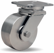
Steel Wheel Caster

http://www.hamiltoncaster.com/Casters/Stainless_Steel_Casters/Workhorse_Stainless_(WHS)_Capacity_to_1_600_lbs.aspx


The product engineering department at Hamilton Caster is proud to release this first of its kind heavy duty stainless steel caster series rated up to 1,600 lbs. load capacity! This caster is designed for extra heavy loads in severe applications where corrosive environments or sanitary considerations demand having all fork and hardware components of stainless steel. The forged stainless steel swivel caster construction includes a 3/4" diameter integrally forged kingpin that is guaranteed for life!
Each caster undergoes a special process after fabrication to insure the removal of embedded contaminants, edge burrs, and surface stresses. The resulting high-lustre finish not only enhances appearance but provides a smoother, less porous surface that-s impervious to dirt and easier to clean - making these casters ideal for chemical factories, food production facilities, pharmaceutical houses, and other wash-down environments.


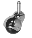
Wood Caster Wheel

Cabinet too heavy for wood wheel casters


http://www.paxtonhardware.com/Wood-Wheel-Swivel-Casters/departments/1662/

Unsure of weight ratio.

Light Wood Wheel Swivel Casters

Wood wheel swivel casters have steel horns and light color hardwood wheels. Swivel casters have ball bearings on which the inserts sit for enhanced swiveling. These shank type wood wheel casters are used with grip-neck steel sleeves (included).


  • Testing for weight capacity is relatively new - as wood wheel casters are reproduction antique casters testing has not been done.

  • Piano Hinge at 30"

    This is the vertical moment of the horizontal kick plate. If Piano hinge has no stop the pin can be placed on the outside of the cabinet

    30"-48"


    Stanley Hardware 70-1470 - 1-1/2X30In Continuous Hinge Br


    $8 online
    Continuous hinges steel carded - screws included bright nickel wdth. X lgth. 1-1/2 inch x 30 Medium gauge construction for use on lids, table leaves, and cabinet doors. Made of .040 gauge material with a .100 pin diameter . 2 inch hole spacing with countersinks for 4 x 1/2 flat wood screws included.
    Stanley Hardware 70-1470 - 1-1/2X30In Continuous Hinge Br

    Tuesday, October 4, 2011

    Speeches

    I thought the speeches were fluent in form. Most people performed well in organizing their presentation. I didn't visit the speaking center but I think I preformed adequately in my ability to relay my topic. Perhaps if I had visited the speaking center I might have done better.

    I posted this on the wrong blog.

    Monday, September 19, 2011

    DC Experience


    The Dc experience to me focused around circulation of museum spaces. Minimalism befined all the interior spaces as well as building shape. Geometric form extruding from the corridor walls stopped the motion of the eye and allowed one to focus upon certain exhibits. Circulation was fluent and well displayed in the Freer as one revollved around a courtyard space. the Hirschorn was a cylinder set upon stilts and having little ground footprint. Circulation was circular with offset halls for excess viewing area.

    Thursday, September 8, 2011

    GHM Analysis


    The “Voices” Exhibit began well. The mass of the room upon entrance was well designed. An oval space with faces lining the walls was an appropriate entrance to an exhibit entitled “Voices”. The oval is more effective to display many images because it provides more flat spaces. This problem of curvature in relation to the display of flat art is evident in the Guggenheim in New York.  The extrusion of some images away from the wall gave depth and dimension to the space, where flat mural images would lack in excitement. Then to further the attractive quality lights were placed behind larger images to draw attention. The images seem to gravitate around the larger images. This technique draws the eye to the larger image with light and size then attention is dispersed to the surrounding objects. One single stool was placed in the center of the oval. This is meant to draw the viewer to a sitting position and a sense of rotation is established around the piece of furniture. However I believe rotation is implied due to the oval form and ring of images. The stool also marks the edge of a corridor in which to travel to the door, but blocks direct travel to the images. The stool could have been left off the circulation route.

    Moving out the door from the oval entrance room the display area zig zags with displays lining the walls. Track lighting illuminates the displays here as well as in the oval entrance. Tiled carpeting sections off space into appropriate squares. The option of the right angle is apparent in the square and the shape of space. The change in color in the exhibits defines the age in history. Red and green are predominant as these are the colors of Greensboro. The displays weave and lead you appropriately into the gift shop. Is this appropriate to have the gift shop at the end of the first exhibit? This may not be the most appropriate pare for the gift shop. This placement commercializes the display and in a way cheapens it. Perhaps the gift shop should be under the mezzanine on the first floor. The option of purchase instead of implied obligation.

    The pottery section is set with historic room detail surrounding it. This is appropriate as pottery could be argued is of more historical significance than room layout. The pottery is displayed on small furniture like blanket chests within the cases. Was this how it was displayed in historical times? Why would you display perishable pottery on a chest that opens on a regular basis? Pottery was probably kept on a shelf where it was away from motion. So to keep with the times of display; appropriate historical shelving can be used to display the pottery. This would cut down on display room, narrowing the cases and allowing the room displays to become more prominent. The reason the pottery is displayed along with furniture is to show the relationship between the two. How much relationship is there between a wooden box and molded clay? The same comparison can be made through historical shelving and pottery, possibly even more so. Maybe shelving and trim can match that of an amoire relevant to the period.

    The Gate City exhibit was divided into separate rooms on opposing sides. There was too much division within this display and no fluid circulation. The rooms were wall papered or plastered. This seemed to cheapen the area. The colors were dull providing no sense of excitement. In certain rooms mechanical elements were present on the ceiling and it distracts from the scene. A disguised drop down ceiling would hide these. The HVAC plenum in the “theater” causes the screen to be offset from center. This room is too small for the purpose and need not exist within the space. There was a sense of confusion and disorganization to the room order of displays. Certain rooms need to be combined. It is not necessary to have a separate room to display two telephone operation stations.  The division wall of fake brick where the fire engine juts out of an irregular opening must be removed. This irregular opening impedes circulation and causes claustrophobia. The purpose of the opening is to allow a view of the fire engine while walking towards the door to the classroom at the end of a dead end hall. The door to the classroom must be at the front windows of the classroom. The door at the rear is not even evident and there is nothing but the removable railing to indicate that one should pass in this direction. This is a waste of space and shouldn’t be there. Opening the wall to the engine room guides the eye into this area after one would pass by the entrance to the classroom. The plenum within the engine area is an eyesore. There is no dropdown ceiling due to the height of the fire engine. Perhaps moving the engine into the street area would allow for a ceiling to be installed. Possibly replacing the ductwork with forced air tubing will decrease its size. This may not be a possibility due to the requirements of air movement for specific areas. Spot track lighting is unnecessary in this area there are few wall displays and the reflection off white walls gives too much glare and institutionalizes the display.

    Another note on the rear exit staircase; if this is the staircase that the lobby was modeled after, is nothing spectacular. It is just a based in staircase. This furthers my decision to remove the base of the lobby stair and expose the space behind as one continual unified mass. The space still may not be usable but the implied reflection of area opens the floor space.

    The Down Home exhibit was very open upon arrival. Single displays were organized in cluttered masses. Structural columns became hindering objects in circulation and view. White walls laid a background against the furniture and pictures. This also institutionalized the scene and gave a feeling that the objects did not belong. Green rectangular rectangles occupied background space and furthered to cheapen the displays.  Modeled displays were set in boxed framing in the middle of circulation tightening the spaces. The display was also exhibited on the first floor. The towers of display were arranged in a tight pillared square. This seemed very uncomfortable to move through.


    Idea Diagram for Industries of The Blind

    Wednesday, September 7, 2011

    Factory Floor Ideas


    This is the first of my reading analysis as this is the first free time I have had this semester. To me this book acts as a diagram in paragraphs. Each chapter descriptively moves through the design process even creating bubble diagrams to elaborate on detail. These chapters assessed the players involved within the design field, clients and users.  The later chapters in the book described ways to view space and to assess the value of potential areas as well as the shaping and molding of sensation imbibed during circulation. Out of all points highlighted within the text I believe motivation is the most important.

    Design theory is the backing behind successful and failing projects. Take for example the Industries of the Blind. The building itself displays no design theory other than that of strict purpose based construction. I don’t consider a structure like this to be architecturally competent in concept. Any contractor can buy plans and build a rectangle based system with casual consistencies in building form. For example standard door dimensions and uniform grays in color of material. The dull boring circulation exists only to sustain simple lifeless organization of manufacturing robots. I make the comparison to robots because of the mechanical resemblance of people working tediously to those of lifeless cogs in a geared machine.

    To correct absence of life and emotion one must define personal space. Thus is the purpose of defined aedicule. To shear the open void into separate rooms each one containing its own experience. This is pointless on the factory floor. But what about a uniform working station that can be aligned to form canals where each worker has a sense of possession no matter where the station is located. Adjacent placement of the singular desk forms a working circulation while displaying uniformity and decreasing the mechanical element. Texture and color of this desk must be warm to relax the worker and increase the fluidity of the working process. The desk cannot contain an overhead unit due to fire suppression systems that hang from the ceiling I beams. Any overhead compartment might be impeding fire suppression as well as affecting the dispersement of light from overhead fixtures hanging from the ceiling. Any overhead compartment above the desks would block the viewing distance and be in the way of moving production units. All storage must be on the sides of underneath.

    To touch on concept again; it is all metaphorical. To release one consistent metaphor throughout the whole of the structure is successful architecture. Even if it is the gears of production, define it well and not just the bare minimum.


    Skills

    A brief overview. I can draft and model with autocad, revit and sketch up. I have skills in photoshop and enjoy physically building models. I would say I am decent with the pencil as well.

    Tuesday, September 6, 2011

    Greensboro Historical Museum


    The Greensboro Historical Museum's main entrance in on the right. Space is open and accesible traveling to both sides and directly in front. A spiraling staircase provides access to the mezzanine. Space condenses under the mezzanine and to the left leading towards the auditorium.

    Friday, August 26, 2011

    Sectional Axonometric Diagram

    This is just the rough draft.

    I will link images and text like these in the boxes in the axonometric drawing.